There’s a reason that ad agencies, branding firms, and interior designers often start new projects by creating a mood board: It’s a great way to brainstorm, explore ideas, yet remain laser-focused during the design process.
If the term is foreign to you, a mood board is a collection of images, objects, and even text posted on a board that evokes or projects a particular feeling, concept . . . or mood. Think Pinterest on steroids!
As the approach becomes better known, more homeowners and apartment dwellers are creating their own mood boards to produce dynamite do-it-yourself decorating. It’s obviously an economical way to go, but it’s smart too. (Why pay a professional when you can use the same tool to create a “look” that is uniquely yours?)
If you’re of a mind to make your own mood board, start with poster material or a strong piece of cardboard large enough to house a variety of exhibits. This is the canvas to which you’ll affix what inspires you. (Speaking of that, a canvas would work too.)
Begin your board with a single image – perhaps a photograph you took or a magazine tear-out – that embodies your vision. It could show a room you relish, a location you love, a scene from nature, or an attractive color combination found anywhere – on a watercolor painting, some wrapping paper or even the wings of a butterfly!
Use this image as the foundation of your color scheme, but don’t stop there. Post images showing similar colors or different hues that you’re drawn to. See how they work together. Refine the color palette by adding or removing elements as you see fit.
And don’t feel that you have to work only in “flat” art. Three-dimensional items, especially those with texture, add an extra layer of visual interest to a mood board. Weave in fabric swatches, bits of tile, fragments of metal. Make a special effort to include items you expect to make an encore appearance in your room’s décor.
Still, color is the essence of an inspirational mood board and nothing contributes as much to a room as the interior paint scheme. So, visit your local paint store and pick up some color cards in your chosen hues. Then post them on your board alongside the other images and exhibits.
Do the paint colors evoke the ambience you want to create in the room? Would you like the space to feel warmer or cooler? Do you sense the need for a change-of-pace punch color? Make the necessary adjustments with the help of your color cards.
Then, before making a final commitment, give your color scheme a real-life eyeball test by observing it both in daytime and at night, under artificial light. Is it appealing regardless of the hour? If the answer is yes, you’ve come up with a winning combination that you’ll love to live with.
Return to the store and pick up the paint colors you’ve chosen, always favoring the highest quality 100% acrylic latex paint. With a confidence inspired by the appeal of your mood board, you’ll soon be in the mood to paint. And, with that, your creative vision will become a reality!
Article from The Paint Quality Institute
Monday, June 26, 2017
Friday, May 19, 2017
Freshen Deck Now Before Summer Starts

The first thing to do is to thoroughly inspect the deck, as well as railings and any adjacent steps or stairs, looking for protruding screws or nails, and damaged or rotted wood.
Tighten loose screws and hammer nails back into place. Then use wood filler to repair damaged wood or, if necessary, replace it completely. Broken boards or badly rotted wood should always be replaced.
If your deck was stained or painted in the past year or two, you might be able to restore its appearance by simply power washing to remove dirt and mildew, and touching up any repaired areas. More likely, if you’ve come this far (or want to change the color of your deck), you’ll be applying a new protective coating.
Today’s most popular options for decks are water-based stains. Compared to solvent-based products, water-based coatings dry more quickly, are largely odor-free, and offer easy cleanup with just soap and water.

Water-based deck stains come in a wide array of colors and two different formulations: semi-transparent coatings and solid-color stains.
Semi-transparent stains protect a deck without hiding the grain or texture of the wood. Solid-color stains, which contain more protective pigment, show the texture of the wood, but not the grain.
The extra pigment in solid-color stains acts as added sunscreen, in effect, helping to shield the wood from the sun’s harmful UV rays. As a result, solid-color stains often last four or five years, while semi-transparent stains typically need to be reapplied at least every other year.
No matter which type of stain you favor, it’s very important to apply a highly durable top quality coating. The best products are made with 100% acrylic; these will better stand up to the rigors of Mother Nature, and to the physical abuse from foot traffic and abrasion from patio furniture, planters, and children’s playthings.
You can apply new deck stain in a number of ways -- with spray equipment, by long-handled roller, or with a high quality brush. For maximum durability, always apply stain in thick, heavy coats. And if you choose to work with a sprayer or roller, take time to go back in while the stain is still wet and “back-brush” it to get better penetration into the wood.
It’s always important to apply a second coat of stain after allowing the first coat to dry thoroughly. For information on drying time and other helpful information, refer to the label on the can and follow the manufacturer’s instructions.
Remember, it’s only three weeks until Memorial Day, and the clock is running. So run out to your local paint retailer, pick up some top quality stain, and get your deck ready for the summer season ahead!
Wednesday, May 3, 2017
Decorating: Nostalgic Style
This is the monthly color and design news update from the companies behind Color Guild. The article aims to preview the forth-coming season and give insight and relevant information for using color to help inspire person projects.
 |
| Graphic by Krissy Brown Designs |
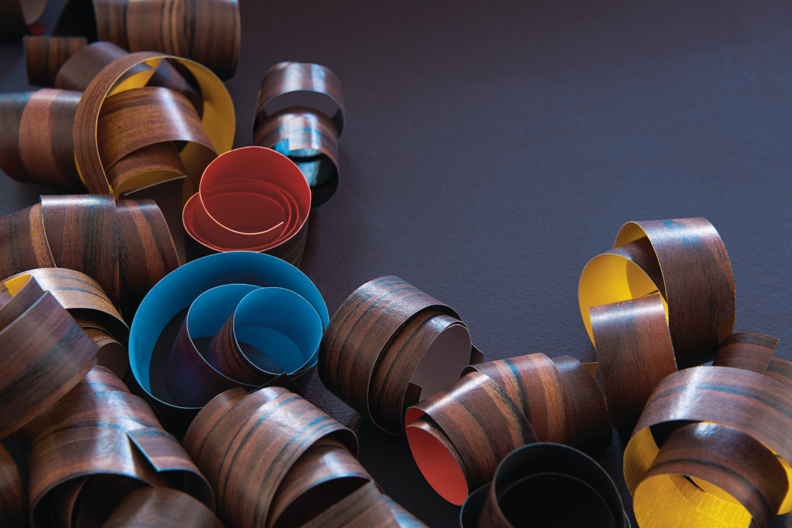
Uncover a nostalgic style for your home with this harmonious palette. Referencing the rhythms and cycles of the earth, this grouping offers and energizing warmth. Celebrating the sepia tinged interiors of 70's styling, the colors speak of decadent design and escapes to sunnier climates. Ground your spaces with striking combinations of mustard yellow and saturated blue, bridging a gap between the past and the future. Look to the colors of deep red, brown, and greens and create emanating heat with this perfect option for interior decoration. Discover a dynamic option to enhance your interior with this complete and considered palette.
|
Add a true sense of comfort with 0494 DARK RIVER, a deep and dark tone that offers the perfect moment of calm within your home. The depths of this shade reference the night sky with an alluring black and green tint. With complex undertones, 0494 DARK RIVER offers the perfect option for study rooms or private spaces adding a sense of focus and quiet meditation. Park this shade with dark wood surfaces or aged metal highlights to enhance the hidden tonal qualities of the color. Combine with tone with the saturated power of 0830 WARM FUZZIES in small proportions for a dynamic and energetic blend.
|
 |
| Colour Hive, colourhive.com |
Taking inspiration from the abstract beauty of desert-like landscapes, 0143 CONNOISSEUR offers and elemental warmth. The strength of this shade creates a classic and comforting atmosphere within interior spaces, perfect for bedrooms or living rooms. 0143 CONNOISSEUR can be contrasted with the vibrancy of 0640 SKYLLA in bold blocking decorative techniques for an energetic combination that echoes the hues of the earth's surface.
|
Look to the natural power of 0060 PARLOR ROSE for an organic and rich option for interiors. Drawing inspiration from raw pigments extracted from the ground this sophisticated mid tone red offers a sense of balance to the palette. Bridging the gap between the darks and the saturated tones, 0060 PARLOR ROSE can be used successfully in domestic spaces such as kitchens and dining rooms. Reminiscent of raw clay ceramics this color can be paired with glazed ceramics and natural textiles to build a textural and innately comforting atmosphere.
|
|
|

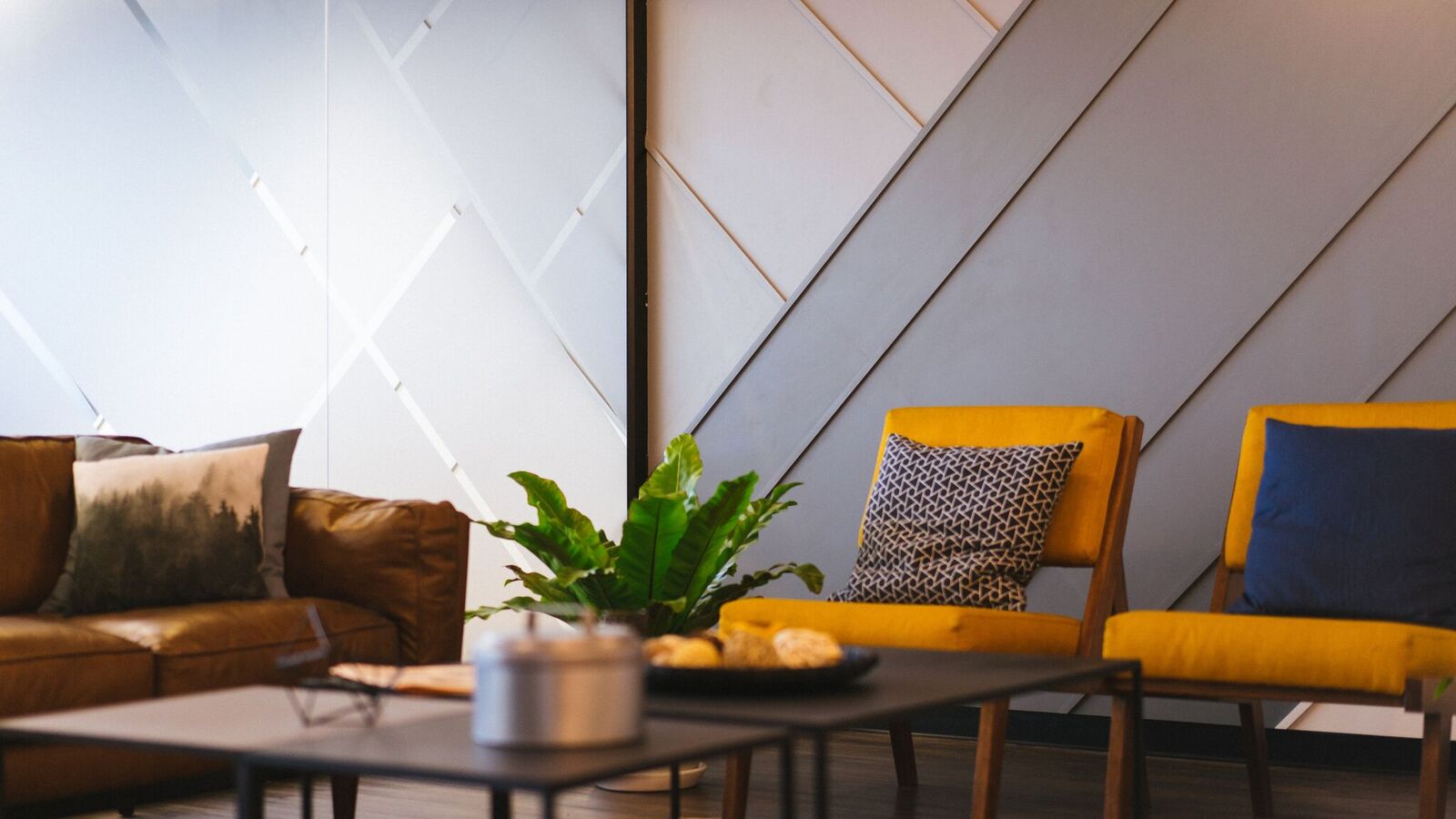
Offering a powerful glow 0830 WARM FUZZIES has a nostalgically warm ambiance that adds a definitive touch of positivity to interior spaces. With a radiating light, this color works perfectly when applied to living rooms and bedrooms to emulate a sunshine mood in a bright and upbeat atmosphere. The saturated quality of 0830 WARM FUZZIES pairs perfectly with the other warm shades within the palette to achieve tonal balance. Marry this tone with bold block color textiles and painted furniture in contrasting colors for a dynamic mix. This playful pop of color will lift any interior space and can be used to decorate your home with a seamless balance of nostalgia and comfort.
|
Lift your spaces with a saturated pop of 0640 SKYLLA, inspired by sunny skies and exotic dye pigments, this color offers a bold contrast within the palette. This bright blue brings a contemporary edge to spaces such as kitchens or children's play areas and bedrooms. Apply 0640 SKYLLA in small proportions and experiment confidently with painted furniture or feature walls. For a bold and striking combination, use with 0830 WARM FUZZIES to discover an upbeat approach to decorating.
|
|
|


Discover dynamic earth tones and bring a feeling of warm sunshine into your home with this complete color range. 0494 DARK RIVER, 0143 CONNOISSEUR, 0060 PARLOR ROSE, 0830 WARM FUZZIES, and 0640 SKYLLA join together to create a harmonious balance of nostalgic style and decorative possibilities. Use in combination throughout your home for the ultimate palette of comforting yet considered colors suitable for a range of spaces. Paris this palette with decorative touches such as painted furniture, wood textures, ceramics, and interior accessories for an energizing atmosphere of 70's style. Explore the enhancing potentials of this eclectic palette and confidently look to the beauty of times past and present when decorating your home.
For the next article, Outdoors: Bright & Bold, we continue our exploration into exterior color ideas with a focus on creating inspirational palettes for your home.
Color Guild looks to Colour hive, the international trend forecasting company, and publisher of MIX magazine for interior decorating advice and ideas. Colour Hive has a track record of accurate color trend information and successful forecasts for the interior and contract markets worldwide.
Monday, April 24, 2017
Invest Tax Refund in Fresh New Color for Your Home
This article is from Debbie Zimmer from the Paint Quality Institute:
If you're expecting to receive a nice tax refund this year, why not spend it on something nice for your home, like some fresh new interior paint color.
Sizable tax refunds aren't uncommon: In 2016, 73% of all taxpayers got money back, with the average refund exceeding $2,800. Experts expect this years refunds to in the same neighborhood.
Exactly how much painting your refund might be able to buy depends on a variety of factors - naturally, the size of the check, but also whether you plan to hire a professional painter or do the painting job yourself.
Home Advisor, a leading website, estimates that it usually costs between $400 and $800 to have a professional repaint a room. The exact cost is a function of many things, including the size of the room, the amount of time the project is expected to take, and the labor rates in your area.
Of course, your refund will go much further if you do the painting yourself. Home Advisor estimates to-it-yourself painting to cost between $200 and $300 per room, or even less if you already have the equipment - less than half what a contractor would charge.
No matter who does the painting, it's obvious that the average tax refund can pay for quite a bit of it: Give a contractor the go-ahead and you'll likely be able to paint three, four, or even more rooms; do your own painting and you can probably give a fresh, new look to your entire interior!
What if you've earmarked your refund for other purposes?
You still might be able to do some painting if you try one or two of the following low-cost options that can make a big difference in the appearance of a home:
 |
| image credit pexels.com |
If you're expecting to receive a nice tax refund this year, why not spend it on something nice for your home, like some fresh new interior paint color.
Sizable tax refunds aren't uncommon: In 2016, 73% of all taxpayers got money back, with the average refund exceeding $2,800. Experts expect this years refunds to in the same neighborhood.
Exactly how much painting your refund might be able to buy depends on a variety of factors - naturally, the size of the check, but also whether you plan to hire a professional painter or do the painting job yourself.
Home Advisor, a leading website, estimates that it usually costs between $400 and $800 to have a professional repaint a room. The exact cost is a function of many things, including the size of the room, the amount of time the project is expected to take, and the labor rates in your area.
Of course, your refund will go much further if you do the painting yourself. Home Advisor estimates to-it-yourself painting to cost between $200 and $300 per room, or even less if you already have the equipment - less than half what a contractor would charge.
No matter who does the painting, it's obvious that the average tax refund can pay for quite a bit of it: Give a contractor the go-ahead and you'll likely be able to paint three, four, or even more rooms; do your own painting and you can probably give a fresh, new look to your entire interior!
What if you've earmarked your refund for other purposes?
You still might be able to do some painting if you try one or two of the following low-cost options that can make a big difference in the appearance of a home:
- giving some new color to the space where you spend the majority of your time;
- enhancing the appearance of the room where your company tends to gather;
- re-doing your entranceway, where visitors form their first impression of your home;
- correcting the color "mistake" you made in the past;
- painting one or more "accent walls" to add some flair to your interior.
If you do decide to invest some of your refund in new color for your interior, here's one last tip: always use top quality 100% acrylic latex paint. The color will continue to look fresh and the finish will wear well for many years to come.
For more information on interior painting, visit the Paint Quality Institute online at blog.paintquality.com.
Article written by Debbie Zimmer, the editor-in-chief of the Paint Quality Institute blog. She's a widely cited authority on color, use of paints in interior and exterior design, and decorative painting techniques. She can be found on Twitter as @paintqualityins.
Founded in 1989, the Paint Quality Institute (PQI) is dedicated to providing information about quality paints and quality painting practices to a wide variety of audiences, including consumers, paint retailers, painting contractors, architects, facility managers, and others who have an interest in getting the most from their investment in interior and exterior paints and coatings.
 |
| Image credit pexels.com |
For more information on interior painting, visit the Paint Quality Institute online at blog.paintquality.com.
Article written by Debbie Zimmer, the editor-in-chief of the Paint Quality Institute blog. She's a widely cited authority on color, use of paints in interior and exterior design, and decorative painting techniques. She can be found on Twitter as @paintqualityins.
Founded in 1989, the Paint Quality Institute (PQI) is dedicated to providing information about quality paints and quality painting practices to a wide variety of audiences, including consumers, paint retailers, painting contractors, architects, facility managers, and others who have an interest in getting the most from their investment in interior and exterior paints and coatings.
Monday, April 17, 2017
Marching Orders for Spring Painting
To everything there is a season, and as March ended, we entered the first stage of the exterior painting season. Depending upon where you live, it may or may not be warm enough to apply paint, but you can still get a jump on things.

Early spring is an ideal time to plan ahead and begin some of the prep work that's key to a well-painted exterior. Carefully inspect the outside of your home and write down what needs to be done. Your notes will serve as a helpful 'marching orders' for the coming paint season.
What to look for? Obviously, any sign of trouble on the siding or trim in the form of paint that is peeling or flaking, but also spots where ugly mold or mildew has taken hold.
Pay special attention to areas where different material meet and note if the caulk is missing or deteriorated. Gaps in the exterior not only detract from the appearance of a home, but they also can create drafts, let costly air conditioning and heat escape, and lead to water damage.
If there's any painted metal on your home's exterior, see if the coating or coatings have been compromised. Is there rust on iron railings or efflorescence (powdery white residue) on aluminum siding, soffit or trim? If so, jot that down.
Not anything else that is amiss with your paint. Nearly any deficiency can detract from the appearance of your home and lessen its production. And correcting these problems quickly may help prevent bigger issues in the future.
Some projects can be done in almost any weather; others are weather-dependent.
For example, you can remove mildew on any dry day without regard to the temperature. Simply scrub the surface with a bleach solution, allow it to sit for 10 minutes or so, then wash away the offensive growth.
Most caulk can be applied when the temperature hits 50 degrees F, but take into account the overnight lows, which could leave surface materials below the threshold, at least earlier in the day. Just clean adjoining surfaces thoroughly, apply a bead of caulk, and smooth it with a moist finger to produce a tight, protective seal.

Likewise, 50 degrees F is typically the cutoff for exterior painting when using a latex coating (again, take overnight temperature into account). If you're doing touch-ups, scrape away any loose or peeling paint, prime bare wood with a quality acrylic latex primer, let it dry thoroughly, then apply one or two coats of 100% acrylic paint. (By using a "paint and primer" product, you can skip the prime coat.
Your home is unlikely to suffer serious harm if you leave bare or primed wood exposed to the elements for a short time. But that's not true with many metals, especially iron.
Once you scrape or sand away rust and expose bare metal, it must be primed immediately and painted as soon as possible afterward, or the rust could reappear in just a couple of days. So, don't start this project unless the weather is warm enough to finish the job.
As you can see, you can make progress on your spring painting by inspecting your exterior, planning the work, and even tackling some projects right now. That's the way to get a great jump on things!
HAPPY PAINTING!!!
This article provided by Paint Quality Institute. To view other articles, please visit them at Paint Quality Institute.
Friday, April 14, 2017
Spring/Summer 2017 Trends
This is the monthly color and design news update from the companies behind Color Guild. The article aims to preview the forth-coming season and give insight and relevant information for using color to help inspire personal projects.
Spring/Summer 2017 sees a refocus on inspirational sources; we are rethinking and reassessing the world around us. As perspectives change we gain more confidence with color usage and in turn, engage with the effect color has on our surroundings. Taking inspiration from our 2017 trends we look to advances in experimental technology, celebrating the hidden beauty of data that lies at the heart of our computerized world. We also explore unknown grounds with an organic and warming theme that reference sunny climates. Feeding our desire to collect and curate our personal spaces we then gain a carefree approach and are tempted by eye-catching aesthetics. Finally focusing on a weightless minimalism that has a universally pure and contemporary atmosphere. These themes will come together to inspire new directions in color and here we share 5 key colors to discover for Spring/Summer 2017.
 |
| Colour Hive, colourhive.com |
Experimental and positive attitude, 0695 INDIAN NECKLACE references the digital world and explores both human and mechanical errors. Inspired by the Glitch trend this color celebrates digital imperfections, using them to inform designs and emphasize the artificial nature of our digital world. Introducing a human element to technology, this green has an acid undertone that is detached from natural or organic connotations. With refreshing and modern feel, 0695 INDIAN NECKLACE can confidently lift your spaces into the now. Use in combination with other saturated tones of the Glitch palette in kitchen spaces and children's bedrooms for a dynamic and energized effect.
 |
| Colour Hive, colourhive.com |
In contrast, 0941 GLOWING LANTERN references our direct connection to colors found in nature. From the Ground trend this tone has a glowing warmth that radiates throughout a space and brings a sense of sunshine to the inside. Desert like landscapes inspire this rich sand yellow color and the tone offers a sense of comfort and refuge. Surround yourself with the lustrous heat of 0941 GLOWING LANTERN and combine this color with the other deep earthy shades of the Ground palette, which are inspired by the raw pigments extracted from the earth. This grouping is perfect for living rooms and bedrooms as it exudes an elemental glow that is sure to add warmth.
 |
| Colour Hive, colourhive.com |
Appealing to our sweet tooth and magpie eye, 1069 PINK TOUCH embodies a carefree attitude with an indulgent edge. Part of the Candy trend this sugary shade has a joyful message that encourages a mix and match style. Inspired by sugared candy treats, this color is designed to catch the eye and deliver a note of positivity. Powdered and pale, 1069 PINK TOUCH can be used in combination with the other shades of Candy for an eclectic mix that encourages a playful approach to color. The milky undertones and soft finish of this tone creates the perfect option for updating kitchens and bathroom areas.
 |
| Pexels, pexels.com |
With an intriguing air, 0589 CELESTIAL HORIZON looks to reduce visual noise with a controlled aesthetic and striped back approach. Inspired by the X-ray trend, this color references the delicate forms we find in nature, but with purity that demands attention. Genderless and seemingly universal grayed blue adds clarity and a reassuring sense of precision within a space. Use in combination with a palette of cool neutrals for a contemporary update. 0589 CELESTIAL HORIZON can add a touch of clean modernity to your bedrooms and study areas for a current and refreshing outcome.
 |
| Pixabay, pixabay.com |
The dark alluring tone of 0536 SUBWAY strips away unnecessary elements to highlight the beauty of the structure of a space. Selected from the X-ray trend this color forms a clean and minimal palette that looks to intense monochrome combinations to reveal what is essential within your home. Referencing core architectural structures, the depth of 0536 SUBWAY acts as a strong and definitive dark tone. Black creates a sense of focus within rooms so use this tone in office areas and hallways in small amounts to highlight architectural details and create a sense of clarity.
 |
| Graphic by Krissy Brown Designs |
0695 INDIAN NECKLACE, 0941 GLOWING LANTERN, 1069 PINK TOUCH, 0589 CELESTIAL HORIZON and 0536 SUBWAY are the five colors we see to be key for Spring/Summer 2017. These tones are taken from the 2017 trends Glitch, Ground, Candy and X-Ray. The colors work across a variety of interior applications and can be used singularly or combined successfully as an all over palette for a space.
These colors all offer something diverse and convey different moods and aesthetics that are on trend. Each color has the potential to add something innovative and exciting to your home, whether it is used in isolation or with our suggested complimentary tones.
For the next article 'Decorate: Nostalgic Style' we continue our exploration into interior decorating ideas with a focus on creating inspirational palettes for your home.
Color Guild looks to Colour Hive, the international trend forecasting company, and publisher of MIX magazine, for interior decorating advice and ideas. Colour Hive has a track record of accurate color trend information and successful forecasts for the interior and contract markets worldwide.
Wednesday, March 8, 2017
The Depth of Blue
This is the monthly color and design news update from The Davis Paint Company and The Color Guild. the article aims to preview the forth-coming season and give insight and relevant information for using color to help inspire person projects.

Looking to the natural world for inspiration, this palette celebrates the beauty of blue and in particular, our deepest oceans. With undeniable appeal, this palette looks to create the ultimate selection of blues for your interior paint schemes. Referencing the unknown elements of the wild seas, these colors explore how we can combine tonal shades to inspire. With light and dark distinctions we encourage exploration into intense colors and contrasts. Bringing a deeper meaning to blue, these colors are a modern alternative to neutrals with a resounding message of positivity and serenity.
Discover the true depths of blue with 0620 STAR STUDDED, an elegant color that offers an arresting alternative to black. Intensely saturated, this dark tone has intriguing depth that references the unknown abyssal zones of our oceans. Shadowy and alluring, 0620 STAR STUDDED is a safe bet for your home if you are looking to create a luxurious and sophisticated atmosphere. This clever color reflects and absorbs light within spaces to echo feelings of water and of weightlessness. Discover the power of tonal blues by combining this shade with contrasting lighter colors such as 0617 JOHNS BLUE and 0650 BRIDGEWATER BAY.

Look to the dynamism of 0655 QUEEN OF THE NIGHT to add a touch of tranquility to your interior spaces. Tinted with a dark teal, this color offers a contrast to the other blues within the palette and evokes feelings of deep pools and wild seascapes. The intensity of 0655 QUEEN OF THE NIGHT has the power to create focus and harmony within spaces and so is most effectively used in studies, offices and dining rooms. Combine with light neutrals to create a revitalizing balance. Alternatively group with contrasting orange and yellow paint accents and accessories for a contemporary and bold effect.

Build a classic mood with 0617 JOHNS BLUE, a stormy sky blue perfect for a variety of interior spaces. With undertones of muted grey, this color grounds the overall palette with a definitive clarity. This tone references dramatic weather conditions but retains a clean and modern atmosphere. Discover possibilities by mixing the depths of 0620 STAR STUDDED and the vibrancy of 0650 BRIDGEWATER BAY with 0617 JOHNS BLUE to create a lively and positive overall effect. This timeless color will balance your spaces and is most effective when used as an all over paint in locations such as kitchens, living rooms and bathrooms.
Energetic and optimistic, 0650 BRIDGEWATER BAY has an uplifting quality perfect for your home. Acting as the vibrant highlight to the other shades in the palette, this color grabs your attention and will instantly refresh your spaces. Allow yourself to be rejuvenated by the power of 0650 BRIDGEWATER BAY and add a touch of positivity to your walls. Pair this shade with the dark tones of 0655 QUEEN OF THE NIGHT and 0620 STAR STUDDED for a combination that demands to be noticed. Look to 0650 BRIDGEWATER BAY and explore the possibilities within kitchen spaces for a clean and modern feel. Also within children's rooms for an energetic and playful all over application.

With an alluring softness 0607 BRUSH BLUE is a barely there tint that contrasts with the dark and mid tones within this palette. Offering an ethereal and powdery feel, this tone is removed from any cold connotations and instead generates a tactile and inviting calm. Look to the chalky finish of 0607 BRUSH BLUE for rooms such as the bathrooms and kitchens and add a clean quality removed from any typical clinical or cold feelings. Open up your small spaces such as hallways and alcoves with this tone, the perfect alternative to stark white or dull neutrals.

Delve into exciting combinations of natural blue with this color range. Look to 0620 STAR STUDDED, 0655 QUEEN OF THE NIGHT, 0617 JOHNS BLUE, 0650 BRIDGEWATER BAY, and 0607 BRUSH BLUE to create a balanced tonal effect perfect for any interior. Express an optimistic and calming mood in your home by utilizing the light and dark contrasts within the palette. This color range may be used successfully as an all over application and in particular look to the tinted blues, perfect for rejuvenating kitchen and bathroom spaces. The intensity of the dark tones can be used to cocoon and calm in personal and private spaces such as bedrooms and living rooms. This palette is dynamic and offers strong combinations for interiors.
 |
| Graphic by Krissy Brown Designs |
Check back next month as we delve into Spring and Summer 2017 Color Trends!
Subscribe to:
Posts (Atom)