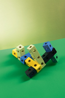
Fall/Winter 2016 sees a refocus on inspirational sources; we are rethinking and reassessing the world around us. As perspectives change, we gain more confidence with color usage and in turn engage with the effect color has on our surroundings.
Taking inspiration from our 2016/2017 trends, we look to the sheer beauty of dramatic landscapes, admiring the powerful and equally fragile planet. Also looking beyond the land, we seek inspiration from the surrounding oceans and into the dark depths of water. Historical and classical references also provide stimulus along with our innate child-like desire to play and interact.
All of the above reference our trends and inspire new directions in color. Here we will share 5 key colors to work with for Fall/Winter 2016/2017.
QUIET PEACE #0592 is a deep-water hue from our trend ABYSS that references the deepest oceans and the seascapes that we are yet to explore. Despite breadth of scientific discoveries in other areas, our planet still provides a great deal of intrigue and inspiration for design. This rich and deep tone can be applied to a variety of environments for a grounding and serene overall affect. This calming, intense blue would work well in a work-space or study area to give clarity and comfort within the space. Build a palette using this tone by combining QUIET PEACE #0592 with others from ABYSS such as softer aqua tones or pale neutral grey's to create a balanced outcome.
www.aytm.dk
IMAGE NAME: EUVIRA.JPG DESCRIPTION: Blue chair and hanging lamp by Classicon
NORTH BEACH BLUE #0485 accompanies the QUIET PEACE #0592 tone from the ABYSS trend furthering the exploration of deep blues. This color references bleached textiles and our continuous pre-occupation with denim, not only in our wardrobes, but in our homes. The textile provides inspiration in the form of the stone washed color of NORTH BEACH BLUE #0485, which can act as an effective and innovative neutral for our walls. A touch of grey is mixed in to move away from sky blue colors, thus softening the tone and results in a more measured and sophisticated outcome for interiors. Pair with sandy beach hues for a gentle complimentary palette, or use tonal schemes of blues from ABYSS for a contemporary and cool look.
www.zanotta.it IMAGE: PLAINENGLISH.JPG DESCRIPTION: Blue
Interior by Plain English,
DUSKY MOOD #1318, comes from the STRATA trend comes into focus and stays grounded in natural references. Charting the impact of the ever-changing landscapes that are redefined by natural forces often beyond our control. STRATA takes note of mans influences on nature and vice versa. Offering an updated version of grey and an alternative to an urban inspired concrete grey tone, here the color gains a dusky purple undertone for added interest. With a new intriguing warmth, DUSKY MOOD #1318 is still easy to use and apply by updating living areas with this inviting yet chic finish, especially when blended with warm taupe's and tinted whites.
www.classicon.com
IMAGE NAME: ZANATTAPARCO.JPG DESCRIPTION: Grey Interior by Zanotta
LOCKHART #0098, from our trend, RIPE, takes classic inspiration from historical still life and paintings and conveys a rich and warm atmosphere suitable for any interior. Indulge in this luxurious color and add softness to your space. This timeless color echoes traditional painting techniques that heavily influenced this trend. The color has strong connotations of interior textiles with its velvety finish. LOCKHART #0098 has an inviting warmth so would work well applied to bedroom walls creating a comforting yet sophisticated overall effect. Combine in an interior palette with accents of deep eggplant purple, teal, and pale mustard from RIPE for a rich contrast within your home.
AYTMSTUDIO.JPG
DESCRIPTION: Pink Interior by AYTM Studio
FROG GREEN #0779 is the stimulating color from our trend PLAY that responds to our inner child. Conveying a positive message, this lighthearted tone encourages interaction with color and with our surroundings, diverting attention away from complex technology and back to using color to stimulate our minds. FROG GREEN #0779 is modern and clean and offers a fresh, bright color for wall and painted furniture applications. This color would work well with children's play areas and bedrooms for an energetic and encouraging atmosphere. Combine this tone with other from PLAY or alongside a monotone color scheme as a highlight. FROG GREEN #0779 would add a fun accent to furniture frames or in painted graphic patterns on the wall.
www.plainenglishdesign.co.uk
IMAGE: GREENROOM.JPG DESCRIPTION: Green children’s bedroom
QUIET PEACE #0592, NORTH BEACH BLUE #0485, DUSKY MOOD #1318, LOCKHART #0098, and FROG GREEN #0779 are the five colors we see to be key for Fall/Winter 2016/2017. These tones are taken from our 2016/2017 trends ABYSS, STRATA, RIPE, and PLAY. The colors work across a variety of interior applications and can be used singularly or combined successfully as an all over palette for a space. These colors all offer something diverse and convey different moods and aesthetics that are on trend. Each color could add something innovative and exciting into your home whether it is used in isolation or with our suggested complimentary tones, it will be a success.
Be sure to check back monthly for new postings! For the next article, we will be talking about the HIDDEN LUXURY OF COLOR. This will continue our exploration into interior decorating ideas with a focus on bringing richness and luxury into the home by using keep color in inspirational palettes.
This is the monthly color and design news update from Davis Paint. The article above aims to preview the forth-coming season and give insight and relevant information for using color to help inspire personal projects.
Please visit our website! The Davis Paint Company


No comments:
Post a Comment
Note: Only a member of this blog may post a comment.